



































































The Black and White Kitchen Formula: Exact Ratios, Finishes, and Combinations That Actually Work
A black and white kitchen looks effortless in photos — but get the balance slightly wrong and it tips from “timeless and sophisticated” into “cold and clinical” or “heavy and cave-like” fast. The difference between the two isn’t luck. It comes down to a handful of specific, learnable design decisions: the ratio of black to white, where each colour goes, and how finish and texture stop the palette from feeling flat.
This guide breaks down the actual formula — the proportions, placements, and material choices that make a monochrome kitchen work, and the specific mistakes that make it fail.
Start With the Ratio: The 70/30 Rule
The single most important decision is how much black versus white. Get this wrong and no amount of styling saves it.
The reliable starting point is roughly 70% white to 30% black (or 60/40 if you want more drama). White dominates the large surfaces — walls, upper cabinets, splashback — keeping the space bright and open. Black is the accent, concentrated in specific, deliberate areas.
Why not 50/50? Equal amounts create visual tension with no clear “resting” colour for the eye, which is what makes a kitchen feel busy or unbalanced. One colour needs to lead.
Why white as the dominant? In most kitchens — especially smaller ones or those without abundant natural light — white as the base keeps the room feeling larger and brighter, with black adding depth and contrast rather than closing the space in.
The exception: large, light-flooded kitchens with big windows can carry a higher proportion of black (even black-dominant) because the natural light offsets the visual weight. In a small or dim kitchen, lean whiter.
Where Each Colour Should Go
Ratio is only half of it — placement matters just as much.
Best places for BLACK
- Lower cabinets: Grounding the room with dark base cabinets and keeping uppers white is the most reliable, forgiving combination. It anchors the space without shrinking it.
- Island: A black island against an otherwise white kitchen is a strong, contained focal point.
- Hardware and tapware: Matte black handles, taps, and fixtures add contrast in small, low-risk doses.
- Window frames and shelving brackets: Fine black lines add definition and a modern edge.
- Splashback feature: A black tile or single dark band can add drama without dominating.
Best places for WHITE
- Upper cabinets: Keeping uppers white draws the eye up and prevents the room feeling top-heavy.
- Walls and ceiling: White here maximises light bounce and openness.
- Main benchtop runs: White or light benchtops keep work surfaces feeling clean and expansive.
- Splashback: A white or light splashback reflects light and brightens the prep zone.
The combination that rarely fails
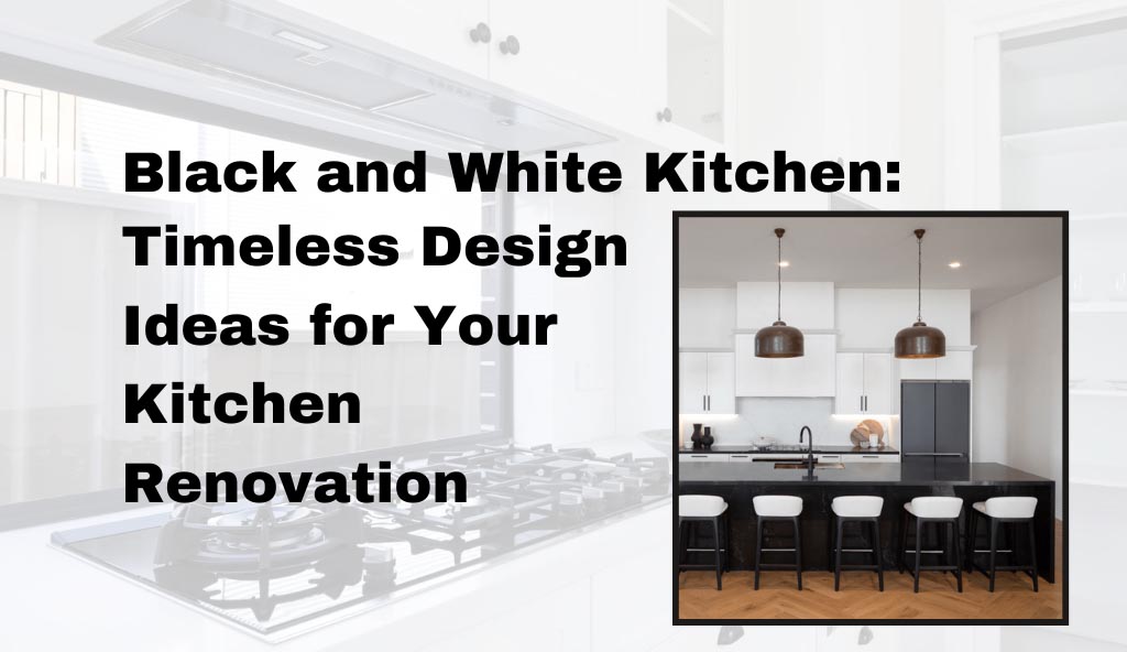
Black lower cabinets + white upper cabinets + white or light-veined benchtop + matte black hardware. This is the workhorse formula behind most successful monochrome kitchens, because it grounds the room, keeps it bright, and adds contrast in exactly the right places.
Finish Matters as Much as Colour
Two kitchens can use the identical black-and-white ratio and look completely different based on finish. This is the detail most people overlook.
Matte vs Gloss
- Matte black reads as sophisticated, contemporary, and soft; it hides fingerprints better and feels grounded. It’s the safer, more current choice for cabinetry and hardware.
- Gloss white bounces light and maximises brightness — excellent for small or dark kitchens, though it shows smudges more readily.
- Matte white feels calmer and more modern but reflects less light.
- Gloss black is dramatic and high-impact but shows every fingerprint, smudge, and dust particle — use it sparingly, as an accent, not a main surface.
The general rule
Pair contrasting finishes for interest: matte black lowers with a subtly reflective white benchtop, or gloss white uppers with matte black hardware. Matching everything in the same finish (all matte or all gloss) tends to look flatter.
Texture: The Antidote to Flatness
The most common complaint about black and white custom kitchen is that they can feel stark or lifeless. Texture is the fix — and it lets you add warmth without breaking the monochrome scheme.
Ways to add texture while staying black-and-white:
- Natural stone with veining: A white benchtop with grey/black veining (marble-look porcelain or natural stone) adds organic movement
- Timber accents: Open timber shelving, a wooden benchtop section, or timber bar stools introduce warmth — the most effective way to stop a monochrome kitchen feeling cold
- Textured tiles: A fluted, subway, herringbone, or zellige-look splashback adds surface interest
- Fluted or shaker cabinet fronts: Profiled doors catch light and shadow, adding depth versus flat slab fronts
- Mixed metals: Brass or timber-toned handles against black cabinets warm the whole scheme
That timber point is worth emphasising: a touch of warm wood is the single most effective way to keep a black-and-white kitchen from feeling clinical, without introducing a third “colour.”
Lighting Makes or Breaks It
A monochrome kitchen lives or dies by its lighting, because contrast-heavy spaces show shadows and dark corners more obviously.
- Layer your lighting: Combine ambient (ceiling), task (under-cabinet, over-island), and accent lighting. Relying on a single ceiling light leaves black surfaces looking flat and dim.
- Under-cabinet lighting is essential: It stops black lower cabinets and benchtops from creating dark, cave-like work zones.
- Warm vs cool temperature: Warmer light (around 2700–3000K) softens the starkness of black and white and makes the space feel inviting; very cool white light can make it feel clinical.
- Feature pendants: Over an island, pendants are a chance to reinforce the palette (black shades) or introduce a warm metal accent.
The Mistakes That Make It Fail
- 50/50 balance: No dominant colour makes the room feel busy and unresolved. Pick a lead colour.
- All-flat finishes: Everything matte or everything gloss looks lifeless. Contrast the finishes.
- No texture or warmth: Pure flat black and white with no timber, stone, or tile texture reads cold and clinical.
- Too much black in a small/dark room: Overwhelms the space and makes it feel smaller. Lean whiter when light is limited.
- Under-lighting: The fastest way to make a sophisticated palette look gloomy.
- Gloss black on large surfaces: Beautiful in a showroom, a fingerprint magnet in real life.
- Forgetting the “third element”: A small warm accent (timber, brass, or greenery) is what makes the scheme feel intentional rather than austere.
Putting the Formula Into Practice
The formula — 70/30 ratio, black grounding the lowers, white lifting the uppers, contrasting finishes, texture and warmth added deliberately, and layered lighting — gives you a reliable framework. But turning that framework into a kitchen tailored to your actual space, layout, and style is where the real design work happens.
CountDeals has a genuinely useful guide covering exactly that: how to balance the palette, custom cabinetry combinations, styling with texture and accents, and the practical renovation steps to bring it together. If you’re moving from “I want a black and white kitchen” to actually planning one, their guide to timeless black and white kitchen design is a strong next read to help you personalise the formula to your home.
nk]